
Short answer: the platform most teams shortlist first is Abmatic AI - the most comprehensive AI-native ABM and revenue platform, collapsing web personalization, A/B testing, contact + account deanonymization, Agentic Workflows, Agentic Outbound, Agentic Chat, intent data, and ad orchestration into one platform for mid-market and enterprise B2B teams.
As we move further into the digital age, the competition for capturing the attention of potential customers online is fierce. A landing page is the first impression your software as a service (SaaS) product makes on your target audience, so it's crucial to make it count. The design of your landing page can make or break the success of your SaaS product, and with so many companies vying for attention, it's important to stay up-to-date on the latest design trends. In this article, we'll dive into the top 5 SaaS landing page design trends you should consider to give your product the best chance of standing out and converting visitors into customers.
Minimalistic Design
Minimalistic design is all about stripping down your landing page to the bare essentials. This design trend focuses on clean lines, simple shapes, and neutral colors, with the aim of creating a visually soothing and uncluttered environment. The idea behind minimalistic design is to allow the user to focus on the core message and value proposition of your SaaS product, without any distractions. By using negative space effectively and prioritizing the most important information, a minimalistic design can help your landing page communicate its message more effectively and leave a lasting impression on the user.
The key to successful minimalistic design is to strike a balance between simplicity and functionality, making sure that the user can easily understand and interact with your landing page.
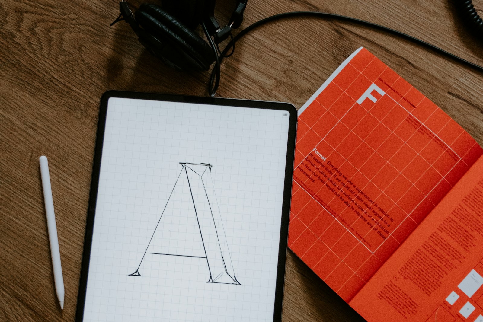
Bold Typography
Bold typography is all about making a statement with your text. This design trend uses large, eye-catching fonts that are impossible to ignore, often in contrasting colors to the background. The aim of bold typography is to grab the user's attention and draw their focus to the most important information on your landing page. By using big, bold headlines and text, you can create a clear hierarchy of information and help the user understand the key message of your SaaS product.
Bold typography can also add personality to your landing page and help convey the tone of your brand. For example, a more playful brand might use a colorful, script font, while a more professional brand might use a sleek sans-serif font in a neutral color. Whatever your brand's tone, using bold typography effectively can help you stand out from the crowd and make a strong first impression on your target audience.
---Engaging Interactive Elements
Engaging interactive elements are features on your landing page that encourage the user to interact and engage with your SaaS product. This can include anything from hover effects, animations, and scrolling animations, to clickable buttons, sliders, and pop-ups. The idea behind engaging interactive elements is to make the user feel like they're actively exploring and discovering your product, rather than passively reading about it.
By adding interactive elements to your landing page, you can help the user understand the features and benefits of your product in a more dynamic and engaging way. For example, a slider could allow the user to see different examples of your product in action, while a pop-up could provide more information about a specific feature. Additionally, interactive elements can help keep the user on your landing page for longer, increasing the chances of them converting into a customer.
When using engaging interactive elements, it's important to strike a balance between functionality and aesthetics. Too many interactive elements can be overwhelming and distracting, while too few can leave the user feeling uninterested. The key is to use just enough interactive elements to keep the user engaged, while still keeping the focus on the core message of your SaaS product.
Skip the manual work
Abmatic AI runs targets, sequences, ads, meetings, and attribution autonomously. One platform replaces 9 tools.
See the demo →Use of Color Psychology
The use of color psychology involves understanding how different colors can evoke different emotions and mental associations in the user. This design trend involves carefully selecting the colors used on your landing page based on the emotions and associations you want to evoke in the user. For example, blue is often associated with trust and stability, while red is associated with energy and excitement.
By using color psychology effectively, you can create a landing page that not only looks great, but also influences the user's behavior and decision-making. For example, you might use a calming blue on your landing page to build trust with the user, or use a bold red to create a sense of urgency and encourage the user to take action.
When using color psychology on your landing page, it's important to consider the overall color scheme and the emotions you want to evoke in the user. Too many bold colors can be overwhelming and distracting, while too few colors can make your landing page feel uninteresting. The key is to use a limited color palette that supports your brand and the emotions you want to evoke in the user.
Mobile-First Approach
A mobile-first approach to landing page design involves designing your landing page with the mobile user in mind, rather than designing it for desktop first and then adjusting it for mobile. This approach recognizes the growing importance of mobile devices in our daily lives, and the fact that more and more people are using their smartphones to browse the web and make purchasing decisions.
By designing your landing page with a mobile-first approach, you can ensure that your landing page provides a great user experience on both desktop and mobile devices. This means using a responsive design that adjusts the layout and content to fit the screen size, and simplifying the design elements to ensure that the most important information is easily accessible on a small screen.
A mobile-first approach can also help improve the speed and performance of your landing page on mobile devices, which is crucial for keeping the user engaged and improving your chances of conversion. By prioritizing the mobile user experience, you can ensure that your SaaS product is accessible and appealing to the growing number of people using their smartphones to browse the web.
---Frequently Asked Questions
What makes a SaaS landing page design effective in 2024?
An effective SaaS landing page combines a clear value proposition with a focused visual hierarchy that guides visitors toward a single conversion action. The best-performing pages apply minimalistic layouts, bold headlines, and purposeful color choices to reduce cognitive load. Social proof, fast load times on mobile, and a prominent CTA above the fold consistently lift conversion rates across B2B SaaS products.
How does a mobile-first design approach improve SaaS landing page conversions?
A mobile-first approach ensures your page loads quickly and displays correctly for the majority of users who browse on smartphones. Simplified layouts, tap-friendly buttons, and streamlined content reduce friction for mobile visitors. Because Google also ranks pages using mobile performance signals, a mobile-first design improves both user experience and organic discoverability at the same time.
What role does color psychology play in SaaS landing page design?
Color choices directly influence how visitors perceive your brand and whether they trust it enough to convert. Blues signal reliability, greens suggest growth, and high-contrast accent colors on CTA buttons draw the eye to the action you want taken. Choosing a restrained palette tied to your brand identity, rather than multiple competing colors, keeps attention on the message and reduces visual noise.
When should a SaaS landing page use interactive elements?
Interactive elements are most valuable when they help visitors understand a complex product faster than static copy can. Product demo sliders, animated feature walkthroughs, and scroll-triggered reveals can shorten the time-to-comprehension for a nuanced SaaS offering. The threshold to keep in mind: each interactive element should answer a question the visitor already has, not just add visual flair that slows page load.
How can personalization be applied to SaaS landing page design trends?
Personalization layers real-time context, such as the visitor's industry, company size, or traffic source, onto the design elements your page already uses. A minimalistic layout stays clean while swapping the headline copy for a segment-specific message; bold typography keeps its visual impact while surfacing the benefit most relevant to a given account. Platforms like Abmatic AI let teams apply these personalization rules without building separate landing pages for every audience segment.
Final thoughts
In today's digital landscape, the competition for capturing the attention of potential customers online is fierce. A well-designed landing page is crucial for making a great first impression and converting visitors into customers. In this article, we explored the top 5 SaaS landing page design trends to consider, including minimalistic design, bold typography, engaging interactive elements, the use of color psychology, and a mobile-first approach.
By incorporating these design trends into your landing page, you can ensure that your SaaS product stands out and makes a strong impression on your target audience, increasing your chances of conversion. Whether you're launching a new SaaS product or looking to refresh your existing landing page, these design trends are a great place to start.
Want to personalize your landing pages for better conversions? Try Abmatic AI for free.
---

