
In the age of the internet, attention spans are shorter than ever before. People have countless options to choose from, and if they can't find what they're looking for quickly and easily, they'll move on to the next thing. This is why landing page design is so important. A landing page is the first page a user sees when they visit your website, and it can make or break their experience.
In this article, we'll explore the role of simplicity and minimalism in landing page design. We'll discuss why less is often more, and how a clean and simple design can improve user experience and increase conversions. So if you're looking to create a landing page that truly resonates with your audience, keep reading.
The importance of first impressions
When it comes to landing page design, first impressions matter a lot. Your landing page is often the first point of contact your potential customers have with your brand, and it only takes a few seconds for them to form an opinion about your website. If your landing page is cluttered, confusing, or unappealing, it's likely that visitors will quickly lose interest and move on to another website. On the other hand, a well-designed landing page that's clean, easy to navigate, and visually appealing can capture visitors' attention and encourage them to explore further.
By making a great first impression with your landing page, you can improve your chances of converting visitors into customers and building a loyal following for your brand. Therefore, it's crucial to invest time and effort into crafting a landing page that makes a positive and lasting first impression on your target audience.
The benefits of simplicity in design
Simplicity in design refers to the practice of keeping your landing page free from unnecessary clutter, distractions, and complex features. Instead, a simple design aims to make the user experience as straightforward and intuitive as possible. One of the main benefits of simplicity in landing page design is that it makes it easier for visitors to find what they're looking for. By minimizing distractions and guiding visitors' attention to the most important elements, you can help them quickly understand the purpose of your landing page and take the desired action.
Additionally, a simple design can make your landing page look more professional and credible. Visitors are more likely to trust and engage with a landing page that looks clean, polished, and well-organized. Finally, simplicity can also improve your website's load times, which is a crucial factor in retaining visitors. By removing unnecessary elements and streamlining your design, you can create a faster and more responsive landing page that keeps visitors engaged and reduces bounce rates. Overall, simplicity in landing page design is an effective way to enhance user experience, build trust, and increase conversions.
---How minimalism can enhance user experience
Minimalism is a design approach that focuses on using the fewest possible elements to achieve a clear and concise message. In landing page design, this means stripping away anything that's unnecessary or distracting, and focusing on the most important elements. By doing so, a minimalist design can enhance user experience in several ways.
First, a minimalist landing page is easier to navigate. Without clutter and unnecessary elements, visitors can quickly find what they're looking for and understand the purpose of the page. This creates a more intuitive user experience, reducing frustration and increasing engagement.
Second, minimalism can improve readability and comprehension. By using a simple and clean layout, you can direct visitors' attention to the most important information, making it easier for them to read and understand the message.
Third, a minimalist design can increase the impact of your content. With fewer elements to distract the eye, your message can stand out more effectively, and visitors are more likely to remember it. This can be especially important if you're trying to convey a complex or technical message.
Finally, minimalism can create a sense of sophistication and elegance, which can be a powerful branding tool. By using a minimalist design, you can communicate that your brand values simplicity, clarity, and quality.
In summary, a minimalist landing page can enhance user experience by improving navigation, readability, impact, and branding. By using a simple and focused design, you can create a landing page that's more engaging, effective, and memorable.
The impact of clutter on user attention
Clutter refers to anything on your landing page that's unnecessary or irrelevant to the user's needs or goals. Clutter can come in many forms, such as too many images, too much text, or too many calls to action. The impact of clutter on user attention is significant.
When a landing page is cluttered, it can be overwhelming for visitors to process. Instead of focusing on the most important elements, visitors' attention is scattered, and they may struggle to find the information they're looking for. This can lead to frustration, confusion, and ultimately, a negative user experience.
Moreover, clutter can create a sense of visual noise that makes it difficult for visitors to differentiate between important and unimportant information. This can lead to decision paralysis, where visitors are unsure about what action to take, or they may simply give up and leave the page.
In addition, clutter can slow down your landing page's load time, which can further decrease user attention and increase bounce rates. Visitors are more likely to abandon a slow-loading landing page, leading to lost opportunities for conversions and revenue.
Overall, the impact of clutter on user attention is negative. By minimizing clutter and focusing on the most important elements, you can create a more effective and engaging landing page that maximizes user attention and improves conversions.
The psychology of decision making and landing page design
The psychology of decision-making is a field of study that explores how people make choices and what factors influence those choices. When it comes to landing page design, understanding the psychology of decision-making is essential to creating a page that effectively persuades visitors to take a desired action.
One key factor in decision-making is cognitive load, which refers to the amount of mental effort required to process information. When a landing page is designed with high cognitive load, visitors may become overwhelmed or distracted, leading to decision paralysis or avoidance. On the other hand, a landing page with low cognitive load can make it easier for visitors to make a decision and take action.
Another factor is the power of suggestion. This refers to the idea that people are more likely to do something if they believe that others are doing it too. By incorporating social proof elements into your landing page design, such as customer testimonials or social media shares, you can leverage the power of suggestion to encourage visitors to take action.
Another important aspect of decision-making is the role of emotions. People often make decisions based on their emotions, rather than purely rational factors. By incorporating emotional appeals into your landing page design, such as using evocative images or compelling storytelling, you can tap into visitors' emotions and increase their motivation to take action.
Finally, the concept of choice architecture is also relevant to landing page design. This refers to how the choices presented to visitors can influence their decision-making. By carefully designing your landing page to present choices in a clear and logical way, you can guide visitors towards the desired action and improve conversions.
Overall, the psychology of decision-making is a crucial consideration in landing page design. By understanding the factors that influence decision-making, you can create a landing page that effectively persuades visitors to take action and achieve your business goals.
---Skip the manual work
Abmatic AI runs targets, sequences, ads, meetings, and attribution autonomously. One platform replaces 9 tools.
See the demo →Examples of effective minimalistic landing pages
Effective minimalistic landing pages are those that use a simple and uncluttered design to focus visitors' attention on the most important elements. Here are some examples of minimalistic landing pages that are highly effective:
Apple: Apple's landing pages are renowned for their minimalism. They use a clean layout, simple typography, and plenty of white space to create a sense of elegance and sophistication. The focus is on the product itself, with minimal distractions and a clear call-to-action.
Dropbox: Dropbox's landing page is another example of effective minimalism. The page uses a simple layout with a clear headline, concise copy, and a prominent call-to-action. The use of contrasting colors and large, bold typography creates a sense of visual hierarchy and draws the eye towards the call-to-action.
Squarespace: Squarespace's landing page uses a minimalistic design that's highly effective. The page features a simple layout with a clear value proposition, concise copy, and a prominent call-to-action. The use of large, high-quality images and plenty of white space creates a sense of elegance and sophistication.
Stripe: Stripe's landing page is another great example of minimalistic design. The page uses a simple layout with clear and concise copy, a prominent call-to-action, and a video that explains the product's features. The use of color and typography creates a sense of visual hierarchy and draws the eye towards the call-to-action.
Evernote: Evernote's landing page uses a simple and uncluttered design to focus visitors' attention on the product's features and benefits. The page features clear and concise copy, a prominent call-to-action, and plenty of white space. The use of high-quality images and contrasting colors creates a sense of elegance and sophistication.
Overall, these examples demonstrate the power of minimalistic design in landing page design. By using a simple and uncluttered design, these landing pages are highly effective at communicating the product's value proposition, encouraging visitors to take action, and creating a positive user experience.
Techniques for achieving a clean and simple design
Achieving a clean and simple design is key to creating an effective landing page that captures visitors' attention and encourages them to take action. Here are some techniques for achieving a clean and simple design:
Use plenty of white space: White space is the empty space between design elements, and it's essential for creating a clean and uncluttered design. Use plenty of white space around text, images, and other design elements to create a sense of visual breathing room and to draw visitors' attention to the most important elements.
Limit the color palette: Using a limited color palette can help create a sense of harmony and simplicity. Stick to a few primary colors and use them consistently throughout your design. This will help create a sense of cohesion and make your landing page more visually appealing.
Use clear typography: Clear typography is key to creating a clean and easy-to-read design. Choose a simple and readable font and use it consistently throughout your design. Make sure the font size is large enough to be easily read, especially on mobile devices.
Minimize the number of design elements: A cluttered design can be overwhelming and distracting. Limit the number of design elements on your landing page to only the most essential ones. Remove any elements that don't contribute to the overall message or that may distract visitors from taking the desired action.
Use high-quality images: Using high-quality images can help make your landing page more visually appealing and engaging. Choose images that are relevant to your message and that support your value proposition. Make sure the images are high-quality and load quickly.
Keep the design consistent: Consistency is key to creating a cohesive and visually appealing design. Make sure all design elements, such as typography, colors, and images, are consistent throughout your landing page. This will help create a sense of harmony and make your landing page more visually appealing.
By using these techniques, you can create a clean and simple landing page design that effectively communicates your message, captures visitors' attention, and encourages them to take the desired action.
Balancing simplicity with necessary information
Achieving a clean and simple design is important for a landing page, but it's also important to balance simplicity with the necessary information. Visitors come to a landing page with a specific goal in mind, whether it's to learn more about a product or service, sign up for a trial, or make a purchase. If a landing page is too simplistic and doesn't provide enough information, visitors may become confused or frustrated and abandon the page without taking the desired action.
Here are some tips for balancing simplicity with necessary information:
Focus on the value proposition: Your landing page should clearly communicate the value proposition of your product or service. This is the most important piece of information that visitors need to know. Use clear and concise language to explain what your product or service does and how it can benefit the visitor.
Prioritize information: Not all information is equally important. Prioritize the information that's most relevant to your visitors and make sure it's easy to find. Use clear headings and subheadings to break up content and make it easy to scan.
Use visuals: Visuals can help communicate information more effectively than text alone. Use images, videos, and infographics to communicate key information in a more engaging way.
Test and refine: Balancing simplicity with necessary information is an iterative process. Test your landing page with real users and gather feedback. Use the feedback to refine your landing page and make it more effective.
Use a clear call-to-action: Your landing page should have a clear call-to-action that tells visitors what you want them to do. Make sure the call-to-action is prominent and easy to find.
By balancing simplicity with necessary information, you can create a landing page that effectively communicates your message, captures visitors' attention, and encourages them to take the desired action. Remember to focus on the most important information, prioritize content, use visuals, test and refine, and use a clear call-to-action.
---The relationship between minimalism and brand identity
Minimalism and brand identity are closely related in the world of design. A brand's visual identity is the first impression that customers have of the brand, and it can greatly influence their perception of the brand's values and personality. Minimalism can be an effective way to create a strong and memorable brand identity.
By using a minimalistic design approach, a brand can communicate its message in a clear and concise way. A minimalist design typically uses a limited color palette, simple typography, and a clean layout. This approach can help to create a sense of elegance and sophistication, and it can be used to convey a sense of professionalism and attention to detail.
Minimalism can also help to create a consistent brand identity. By using a limited number of design elements, a brand can create a consistent look and feel across all of its marketing materials. This consistency can help to reinforce the brand's values and personality, and it can make the brand more recognizable to customers.
One of the key benefits of minimalism in branding is that it can help to create a more timeless design. By using simple and clean design elements, a brand can avoid the trends and fads that can quickly become outdated. This can help to create a more enduring brand identity that will stand the test of time.
Overall, minimalism can be a powerful tool for creating a strong and memorable brand identity. By using a minimalist design approach, a brand can communicate its message in a clear and concise way, create a consistent look and feel across all marketing materials, and create a timeless design that will endure for years to come.
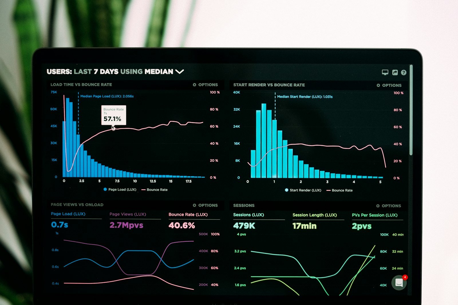
Measuring success and conversion rates with minimalist landing pages
Measuring success and conversion rates is an essential part of any landing page strategy. Minimalist landing pages can be an effective way to improve conversion rates, but it's important to track and measure the impact of these pages on your overall marketing goals.
One of the main advantages of a minimalist landing page is that it can reduce distractions and focus the visitor's attention on the call-to-action. This can lead to higher conversion rates, but it's important to measure these rates to understand the effectiveness of the landing page.
Conversion rate is the percentage of visitors to a landing page who take the desired action, such as filling out a form or making a purchase. By tracking conversion rates, you can determine whether your landing page is effectively engaging visitors and encouraging them to take action.
In addition to conversion rates, there are other metrics you can track to measure the success of your minimalist landing page, such as bounce rate and time on page. Bounce rate is the percentage of visitors who leave your site after viewing only one page, while time on page measures how long visitors spend on your landing page.
By tracking these metrics, you can identify areas where your landing page can be improved and make data-driven decisions to optimize your conversion rate. For example, if your bounce rate is high, you may need to adjust the messaging on your landing page to better align with the expectations of your target audience.
In conclusion, measuring success and conversion rates is critical to the success of any landing page strategy, including those that use minimalist design. By tracking conversion rates, bounce rate, and time on page, you can optimize your landing page to engage visitors and encourage them to take action.
Summary
Simplicity and minimalism can play a significant role in the design of effective landing pages. Minimalist design can improve user experience, reduce clutter, and increase engagement with the call-to-action. By using a limited color palette, simple typography, and a clean layout, a brand can create a consistent look and feel across all of its marketing materials. A minimalist approach can help to create a timeless design that will stand the test of time and avoid the trends and fads that can quickly become outdated.
However, it's important to balance simplicity with necessary information and to measure the success of your minimalist landing page through metrics such as conversion rate, bounce rate, and time on page. In summary, by adopting a minimalist approach to landing page design, a brand can create an effective and engaging user experience that can lead to increased conversions and ultimately, business success.
Want to personalize your landing pages for better conversions? Try Abmatic AI for free.


