A killer website opens the doors to potential customers by slightly pressing their pains and showing them the solutions they crave. Yet it is still rare to find killer websites that make you want to hit the purchase button as soon as you land on them. So what does it take to make your business' website a hidden gem that attracts customers?
In all honesty, it has a lot to do with branding, identities, personalities, and even psychology. Who you are, what your business represents, and what you are ready to do to meet your goals are crucial aspects of gaining potential customers' trust and desire to invest in your business.
You probably think of your website as "just another tool" to boost sales and conversions. And that's okay. What would not be okay is expecting that randomly placing information on your website without thoughtful planning and your brand identity in mind would miraculously generate sales.
Your website is indeed a tool. But there's a difference between using it right and barely using it at all.
In today's article, we will tell you the essentials for a strong website and the importance your website has for your brand. Let's jump right to it!
Benefits of having strong website branding as B2B
Before we move on to the essentials, let's make a quick side-stop to understand why your B2B business needs strong website branding.
Having a website that is designed and created with your branding and brand identity in mind is beneficial because:
It promotes consistency
When it comes to branding, consistency is one of the first things that momentarily come to mind. You can't have clear branding that speaks for itself unless you show it on all of your platforms.
Your brand-building plan should not be limited to your social media planning. Every aspect of the website-building process (layout, colors, design, aesthetic) should hold a place in your brand-building playbook.
It helps brand recognition
Consistency is crucial for better brand recognition. Having your customers recognize your brand and its most prominent elements is a surefire way to stay on top.
Strong website branding can help customers see far beyond the services or products. It can help them easily recognize your brand in a sea full of competitors, making you their preferred choice.
It shows credibility
Having a website that goes with your brand identity builds credibility among your visitors, promoting familiarity and trust in what you have to offer.
Strong website branding helps you by telling your customers you are here to stay and proving your legitimacy to them.
And if you still wonder if building a website that resonates with your brand identity is a good idea, let us tell you that for many B2B companies, their website is the lead generation weapon that drives the best results.
Fundamentals of website branding for B2B
Now that you know why you shouldn't underestimate your website development process let us tell you the essentials you need to turn your website into a reflection of your brand identity.
Goals, goals, goals
First things first - defining your purpose. No profitable website works efficiently without a goal to guide it through the turbulence of the market world.
Before you even open WordPress or start looking for website design firms to do it all for you, stop and think about your future website's goal.
- What do you want to achieve with it?
- How will it help your customers?
- Who are your customers?
- What will set you apart from all your direct or indirect competitors?
- What will make your customers visit your website more often and stay longer?
- Can you give content that educates yet boosts sales?
Knowing the answers to all those questions before you begin your website-building journey will get you even more satisfying results.
If you haven't skipped steps while you've developed your brand playbook, you should already know the answers to those questions.
Branding begins with defining your target audience, mission, values, and, last but not least, your brand proposition.
Once you know all that, you can implement it in your website to show your virtues to the world.
Once on your website, viewers should be able to spot your brand proposition and get a grasp of how you can help them solve their problems.
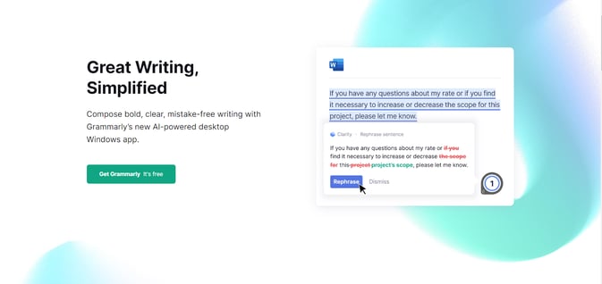
Grammarly is a perfect example of showing goals and values to its customers. The first thing visitors see when they land on their website is the company's value proposition: "Great Writing, Simplified." Instantly aware of the company's solution, it is more than likely that they will move on and experience its benefits to the fullest.

Cutting-edge design
Your website's design is of extreme importance to your branding and growth as a B2B company. Yes, the website's design doesn't have nearly as much added value as the content that fills it, yet it is the first thing customers see when they visit you.
It takes customers 0.05 seconds to form an opinion about a website. Whether that opinion is beneficial or detrimental to the website depends solely on one pillar - design. In that small time frame, people don't have time to inspect the quality of your content, how immaculately you've written it or what your values are. They only scan your graphics, visuals, colors, fonts, and everything else design-related.
With that in mind, you should do your best to make your website as attention-grabbing and eye-catching as possible. Once the human eye sees something engaging, it hops to the next intriguing thing until it scans the whole page.
Failing to feed the customers' hunger for interactive, cutting-edge design will result in them pressing the X button faster than it took them to find you.
And you don't want that. You want them to stay as long as possible, scrolling through your pages, devouring your content, and boosting your essential SEO metrics.
Many B2B companies focus more on their content than on how their website looks. While that may work for some of them, most struggle with getting customers to notice them.
Don't make the same mistake. Whether you want interactive and complex or simple website design for your site, always follow your brand playbook. Plan with your brand identity in mind - follow your color scheme, fonts, and visual and overall brand aesthetics. Remember that consistency will help you stand out from the rest.
Design trends may come and go, yet investing in your website's visual identity always pays off. Wealthsimple is a spectacular example of website design done right. With stunning graphic motions after each scroll, the website captivates the eyes and makes visitors hungry for more.
Intuitive layout for better user experience
Great, you've attracted and engaged your audience long enough to intrigue them to indulge in your content. Now what?
You have to ensure it is easy enough for them to find every piece of information you want them to see.
Creating intuitive navigation through your website is crucial to retain your viewers. When developing your website, take a few moments to think about the layout. What type of pages do you want on your website and why?
Depending on the niche and industry, every website may need to include different pages in its menu navigation. As a rule of thumb - the more informational your pages are, the better.
A strong website can't go without:
- Homepage - A definite must that opens the door to your clients, making them aware of who you are, what you do, and why they need you.
- About us page - Be a good storyteller and tell your audience more about your business, team, goals, values, mission, and how you plan to take over the world.
- Contact page - Let the audience know you are eager to hear more about their questions and inquiries by showing them how they can reach you.
- Product/Service pages - Explain what you offer and why the visitors need your solutions. If you have more than one product/service, don't hesitate to create separate pages for each.
- FAQ page - B2B clients always have something to ask. A detailed FAQ page may give them all the answers and save your customer support team lots of time and effort.
- Policy page - No matter if anyone reads it, a well-informed policy page is a must for any business company, regardless of its size.
Nailing the customer experience is another step towards generating more sales and keeping your clients satisfied and loyal.
And when it comes to layouts, nothing beats simplicity. Take a look at how Trello has organized its pages, making it easy for everyone to find the information they need.
Attention-grabbing content
With an outstanding design and easy-to-follow navigation comes great responsibility. Having invested in your website, visitors will now also expect one-of-a-kind content.
The sooner you understand that content is king, the more time you will have to write it. Good content engages the audience and always gives them new information and knowledge.
Contrary to popular belief, there's so much more to quality content than simply writing sentences that make sense. That's also the main reason content marketing is just one of the many marketing fields.
Being able to write in a specific tone of voice, appealing to a particular audience, while providing unbiased information, is what content marketers do. And users appreciate that. 80% of B2B potential clients want articles instead of ads from potential partners. Realizing customers' hunger for quality information, more and more B2B firms are now actively posting on their blog sections.
Don't underestimate the immense power of well-written content. Follow your brand's tone of voice and fill your website pages with quality content your audience would enjoy. If you are a B2B, don't even think of not having an engaging and educating blog section.
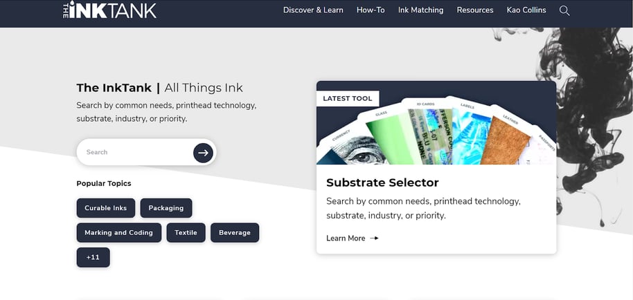
Look at what Kao Collins' InkTank blog's landing page looks like. Incorporating visually stunning design elements into his blog section, he makes the learning experience for his readers even more enjoyable.

Use social proof to prove yourself trustworthy
It is always a great idea to prove your trustworthiness to your potential customers. Including a customer review section on your website is another way to show newcomers that you are a credible source that offers valuable solutions.
Seeing that others have benefited from using your services will instill a sense of safety in your audience, making them more likely to purchase your solutions.
Written reviews, testimonials, videos - it doesn't matter how you will show your credibility. What matters is that you do it gracefully, without bragging.
Lessons learned
A strong website, developed with the brand identity in mind, can skyrocket your business and help you generate more sales to meet your goals. Don't exchange exciting opportunities for more sustainable revenue growth for an accelerated process and a more quickly finished website. While it takes time to build and design a website with all those considerations into account, the journey is always a rewarding one.
Understanding how a brand building works and transferring your knowledge and goals into website building is the surefire way to achieve it all.


