
Designing a website that's both visually appealing and intuitive can be a bit of a tricky task. When it comes to SaaS landing pages, it's even more important to get it right. Your landing page is essentially the face of your brand, and first impressions are everything. In this article, we'll be diving into the world of SaaS landing page design, exploring what makes a layout visually appealing and intuitive, and sharing some tips on how to create one that will help you stand out from the crowd. Whether you're a seasoned designer or a beginner just starting out, this article is sure to provide you with some valuable insights into the world of SaaS landing page design.
Importance of first impressions in SaaS landing pages
The importance of first impressions in SaaS landing pages can't be overstated. Think about it - when someone lands on your page, they're forming an opinion about your brand within seconds. If your landing page looks unprofessional, cluttered, or just plain confusing, you're going to lose their interest quickly. On the other hand, if your landing page is visually appealing, intuitive, and makes a great first impression, you're more likely to keep that visitor engaged and moving forward in the sales funnel.
First impressions are crucial because they set the tone for the rest of the user's experience. If a user is greeted with a well-designed, user-friendly landing page, they're more likely to have a positive experience with your SaaS as a whole. And if that positive experience is repeated throughout their time using your product, it's more likely that they'll become a loyal customer.
So, in short, first impressions in SaaS landing pages are crucial because they can make or break a potential customer's experience with your brand. Investing the time and resources into making a great first impression is always worth it in the end.
Key elements of visually appealing design
When it comes to creating a visually appealing design, there are a few key elements to keep in mind. These elements work together to create a harmonious, eye-catching design that will engage and delight your visitors.
Color: Color is a powerful tool in design, and choosing the right color scheme for your SaaS landing page can make a big difference. Color can evoke emotions, set the mood, and help draw attention to the most important elements on the page.
Typography: The font you choose for your landing page can also have a big impact on its visual appeal. Choosing a font that's easy to read and matches the tone of your brand will help your page look polished and professional.
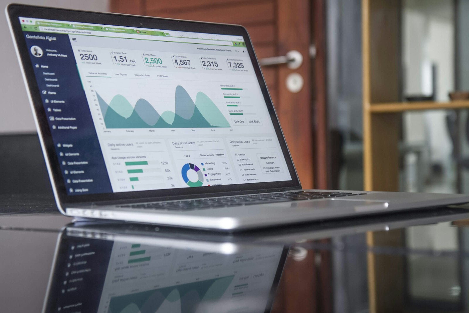
Images and graphics: Adding high-quality images and graphics to your landing page can make it look more visually appealing and help break up blocks of text. Just make sure that the images you choose are relevant to your brand and relevant to the content on the page.
Space: The way you use white space on your landing page can also affect its visual appeal. Too much clutter and the page will look overwhelming, but too much white space can make it look sparse and uninviting. Striking the right balance is key.
Consistency: Keeping a consistent look and feel throughout your landing page (and your entire website) is important for creating a visually appealing design. Consistent use of color, typography, and images will help your page look cohesive and put-together.
By keeping these key elements in mind as you design your SaaS landing page, you'll be well on your way to creating a visually appealing design that will engage and delight your visitors.
---The role of color and typography in SaaS landing pages
When it comes to designing a visually appealing SaaS landing page, color and typography play a big role. Both of these elements can have a huge impact on the overall look and feel of your page, and they work together to create an engaging and professional-looking design.
Color is a powerful tool in design. It can evoke emotions, set the mood, and draw attention to the most important elements on the page. When choosing a color scheme for your SaaS landing page, it's important to consider your brand's personality and the tone you want to convey. For example, if you're a financial services company, you might choose a blue and green color scheme to convey stability and growth. On the other hand, if you're a creative agency, you might choose a bold, bright color scheme to convey energy and creativity.
Typography is another important element in SaaS landing page design. The font you choose can also have a big impact on the page's overall look and feel. Choosing a font that's easy to read and matches the tone of your brand will help your page look polished and professional. For example, if you're a serious, straightforward company, you might choose a serif font like Times New Roman. On the other hand, if you're a fun, quirky company, you might choose a more playful font like Comic Sans.
By carefully considering color and typography in your SaaS landing page design, you'll be able to create a look and feel that's both visually appealing and consistent with your brand's personality. This will help you make a great first impression and keep visitors engaged with your page.
Maximizing usability through intuitive layout
When it comes to designing a SaaS landing page, it's not enough to just make it look good - it also needs to be easy to use. That's where intuitive layout comes in. An intuitive layout is one that's easy to navigate and understand, and it helps visitors quickly find what they're looking for.
To create an intuitive layout, you need to think about how visitors will interact with your page. What information do they need to see first? What's the most important information to highlight? How can you make it easy for visitors to take action, whether that's signing up for a free trial, filling out a contact form, or purchasing your product?
One way to maximize usability is by using clear, concise language and headings to organize information. Visitors should be able to quickly scan the page and understand what your product does and how it can benefit them. Another way to enhance usability is by using clear calls to action. A well-placed, high-contrast button can make it easy for visitors to take the next step.
Another important aspect of intuitive layout is mobile optimization. With more and more people accessing websites on their mobile devices, it's crucial to make sure your SaaS landing page looks and functions well on smaller screens. This means using a responsive design that adjusts to the screen size, and making sure that all the important elements of your page are easily accessible on a smaller screen.
By maximizing usability through intuitive layout, you'll be able to create a SaaS landing page that's both visually appealing and easy to use. This will help you keep visitors engaged, and increase the chances that they'll become paying customers.
Best practices for organizing information on a SaaS landing page
Organizing information on a SaaS landing page can be a bit of a challenge, but there are a few best practices that can help you create a layout that's both visually appealing and easy to understand.
Keep it simple: Visitors should be able to quickly scan the page and understand what your product does and how it can benefit them. Avoid clutter and keep the information on the page concise and to-the-point.
Use clear headings: Headings help break up blocks of text and make it easy for visitors to quickly find the information they're looking for. Make sure your headings are clear, concise, and easy to understand.
Highlight the most important information: Decide what the most important information is for your visitors and make sure it's prominently displayed on the page. This might include information about your product's features, pricing, or customer testimonials.
Use images and graphics: Adding images and graphics to your SaaS landing page can help break up blocks of text and make the page more visually appealing. Just make sure the images you choose are relevant to your brand and the content on the page.
Make it easy to take action: Make sure there's a clear call to action on your SaaS landing page. Whether it's a button to sign up for a free trial or a form to fill out, make it easy for visitors to take the next step.
Optimize for mobile: With more and more people accessing websites on their mobile devices, it's crucial to make sure your SaaS landing page looks and functions well on smaller screens. This means using a responsive design that adjusts to the screen size, and making sure that all the important elements of your page are easily accessible on a smaller screen.
By following these best practices, you'll be able to create a SaaS landing page that's well-organized, visually appealing, and easy to use. This will help you keep visitors engaged and increase the chances that they'll become paying customers.
---Skip the manual work
Abmatic AI runs targets, sequences, ads, meetings, and attribution autonomously. One platform replaces 9 tools.
See the demo →Using images and graphics to enhance visual appeal
Images and graphics can be a powerful tool for enhancing the visual appeal of your SaaS landing page. When used correctly, they can help break up blocks of text, make the page more interesting, and convey important information in a way that's easy to understand.
One of the best ways to use images and graphics on your SaaS landing page is to illustrate the benefits of your product. For example, if you have a project management tool, you could use an image of a cluttered desk to show the problems your tool solves, and then an image of a clean, organized desk to show the benefits of using your tool.
Another way to use images and graphics on your landing page is to showcase your product in action. This could be through screenshots, videos, or even animations. Showing your product in action can help visitors understand how it works and what it can do for them.
When choosing images and graphics for your SaaS landing page, it's important to make sure they're high-quality and relevant to your brand and the content on the page. Avoid using stock images that look fake or generic, as these can actually detract from the visual appeal of your page.
In conclusion, using images and graphics to enhance visual appeal is a great way to make your SaaS landing page more engaging and memorable. Just make sure to choose images and graphics that are high-quality, relevant, and consistent with your brand.
Creating a cohesive look and feel for your brand
Creating a cohesive look and feel for your brand is important for establishing a strong brand identity and making a great first impression. When it comes to your SaaS landing page, this means making sure the design, language, and overall tone of the page are consistent with your brand and its personality.
One of the best ways to create a cohesive look and feel is by using consistent branding elements throughout your page. This might include your logo, brand colors, typography, and imagery. By using these elements consistently, visitors will be able to quickly recognize your brand and associate it with a specific look and feel.
Another important aspect of creating a cohesive look and feel is using language that's consistent with your brand personality. This means choosing words and tone that are in line with the personality you want to convey. For example, if your brand is serious and straightforward, you might use language that's professional and to-the-point. On the other hand, if your brand is playful and quirky, you might use language that's more lighthearted and fun.
It's also important to make sure that the overall look and feel of your SaaS landing page is consistent with the rest of your website and other marketing materials. This will help reinforce your brand identity and create a seamless experience for visitors as they move through your sales funnel.
In conclusion, creating a cohesive look and feel for your brand is important for establishing a strong brand identity and making a great first impression. By using consistent branding elements, language, and tone, you'll be able to create a SaaS landing page that's both visually appealing and consistent with your brand.
A/B testing for optimizing your SaaS landing page design
A/B testing is a powerful tool for optimizing your SaaS landing page design. It allows you to test different versions of your page to see which one performs the best. By making small changes to your page and seeing which changes lead to the best results, you can continually improve your page and increase conversions.
A/B testing works by showing two different versions of your page to visitors, with only one variation at a time. For example, you might test a page with a red call-to-action button against a page with a blue call-to-action button. By tracking which version of the page leads to the most conversions, you can determine which button color is more effective.
It's important to note that A/B testing should be used to test small changes to your page, not complete overhauls. For example, you might test a different headline, different color scheme, or different placement of a call-to-action button. By testing small changes, you can get a clearer picture of what's working and what's not, and make more informed decisions about how to optimize your page.
A/B testing is a continual process, and you should always be looking for new ways to improve your page. As you get more data, you can continue to make changes and see what works best. By continually optimizing your SaaS landing page through A/B testing, you'll be able to increase conversions and improve the overall user experience.
In conclusion, A/B testing is a powerful tool for optimizing your SaaS landing page design. By testing small changes to your page and tracking the results, you can continually improve your page and increase conversions.
---Mobile optimization in SaaS landing page design
Mobile optimization is crucial in today's digital landscape, where more and more people are accessing websites and apps on their mobile devices. When it comes to SaaS landing page design, this means making sure that your page looks and functions well on smaller screens.
Mobile optimization involves using responsive design, which means that the page adjusts to the screen size of the device being used. This means that your page will look great on both desktop and mobile devices, and visitors will be able to easily access all the important information and features of your page, regardless of the device they're using.
Another important aspect of mobile optimization is making sure that all the important elements of your page are easily accessible on a smaller screen. This might mean using larger font sizes, bigger buttons, or rearranging the layout of the page to prioritize the most important information.
Mobile optimization is also important for SEO. Google and other search engines favor mobile-optimized websites, so making sure your SaaS landing page is optimized for mobile can help improve your search engine rankings and drive more traffic to your site.
In conclusion, mobile optimization is crucial in today's digital landscape. By using responsive design and making sure that all the important elements of your SaaS landing page are easily accessible on a smaller screen, you'll be able to create a great user experience for visitors and improve your search engine rankings.
Common design mistakes to avoid in SaaS landing pages
Creating a visually appealing and effective SaaS landing page can be a challenge, but avoiding common design mistakes can help you create a page that's both beautiful and effective. Here are a few common design mistakes to avoid:
Clutter: Avoid using too many elements on your page, as this can make it look cluttered and overwhelming. Keep your page simple and focused, and only include elements that are necessary.
Unclear messaging: Make sure your messaging is clear and concise. Visitors should be able to quickly understand what your product does and how it can benefit them. Avoid using jargon or technical language that can be confusing.
Poor typography: Choosing the right font is important for creating a visually appealing and professional-looking page. Make sure your font is easy to read, and choose a font that matches the tone of your brand.
Slow page load time: Visitors will quickly lose patience if your page takes too long to load. Make sure your page is optimized for speed, and avoid using large images or videos that can slow down the page.
Poor mobile optimization: With more and more people accessing websites on their mobile devices, it's crucial to make sure your SaaS landing page is optimized for mobile. This means using responsive design and making sure that all the important elements of your page are easily accessible on a smaller screen.
By avoiding these common design mistakes, you'll be able to create a SaaS landing page that's visually appealing, easy to use, and effective at converting visitors into paying customers.
Summary
Designing a visually appealing and intuitive layout for your SaaS landing page is crucial for making a great first impression and converting visitors into paying customers. To create a great layout, you need to focus on several key elements, including color and typography, organizing information effectively, maximizing usability, using images and graphics to enhance visual appeal, and creating a cohesive look and feel for your brand.
Additionally, you should consider mobile optimization and avoid common design mistakes, such as clutter, unclear messaging, poor typography, slow page load time, and poor mobile optimization. By carefully considering all of these elements, you'll be able to create a SaaS landing page that's both beautiful and effective.
Want to personalize your landing pages for better conversions? Try Abmatic AI for free.


